Brand Identity
The foundation of our visual language
Brand Essence
Beblon represents luxury, craftsmanship, and timeless elegance in furniture design. Our brand identity reflects the warmth of copper, the richness of gold, and the sophistication of deep charcoal tones, creating a visual language that speaks to discerning homeowners in Saudi Arabia and beyond.
Luxury
Premium materials, refined finishes, exceptional quality
Craftsmanship
Handcrafted excellence, attention to detail, artisan heritage
Customization
Bespoke solutions, personal expression, tailored design
Elegance
Timeless aesthetics, sophisticated style, refined taste
Brand Name
Pronunciation: BEB-lon (emphasis on first syllable)
Never: Beblan, Bebloon, Bebolin
Tagline
أثاث فاخر وخزائن مخصصة
Premium Furniture & Custom Wardrobes
The tagline should always appear in both languages when space permits.
Color Palette
Our colors reflect warmth, luxury, and sophistication
Primary Colors
Copper
Primary brand color. Use for CTAs, accents, and key elements.
Copper Light
Hover states, highlights
Copper Dark
Active states, depth
Accent Colors
Gold
Premium highlights, gradients, special elements
Gold Glow
Glows, sparkles, emphasis
Neutral Colors
Charcoal
Primary background (dark mode)
Charcoal Light
Cards, surfaces, elevations
Warm Gray
Borders, dividers, subtle elements
Cream
Primary text, light elements
Gradients
Luxury Gradient
Primary gradient for buttons, accents
linear-gradient(135deg, hsl(25, 60%, 50%) 0%, hsl(38, 75%,
                  55%) 100%)
Dark Gradient
Background depth, overlays
linear-gradient(180deg, hsl(30, 15%, 4%) 0%, hsl(30, 12%,
                  10%) 100%)
Card Gradient
Card backgrounds, surfaces
linear-gradient(145deg, hsl(30, 12%, 12%) 0%, hsl(30, 10%,
                  8%) 100%)
Typography
Our type system balances readability with character
Kufam
Display / Headlines
Kufam is our display typeface, used for all headlines and titles. Its geometric construction with subtle Arabic influences creates a distinctive, premium feel that works beautifully in both languages.
Fustat
Body / UI Text
Fustat provides excellent readability for body text and UI elements. Its variable weight range offers flexibility across all text sizes.
Type Scale
Logo Usage
Guidelines for proper logo application
Primary Logo — White
Use on dark backgrounds (preferred)
Primary Logo — Color
Use on light backgrounds
Logo Variations


Clear Space & Sizing
Clear Space
Maintain clear space equal to the height of the "B" letterform (X) on all sides of the logo. This ensures visual breathing room.
Minimum Size
To ensure legibility, never reproduce the logo smaller than 25mm wide in print or 80px wide on screen.
Logo Misuse
Never apply these treatments to the logo
UI Components
Interactive elements and design patterns
Buttons
Cards
Card Title
Premium furniture crafted with excellence
Form Elements
Shadows & Effects
--shadow-soft
--shadow-luxury
--shadow-glow
Spacing System
Border Radius
Imagery
Visual content guidelines and photography style
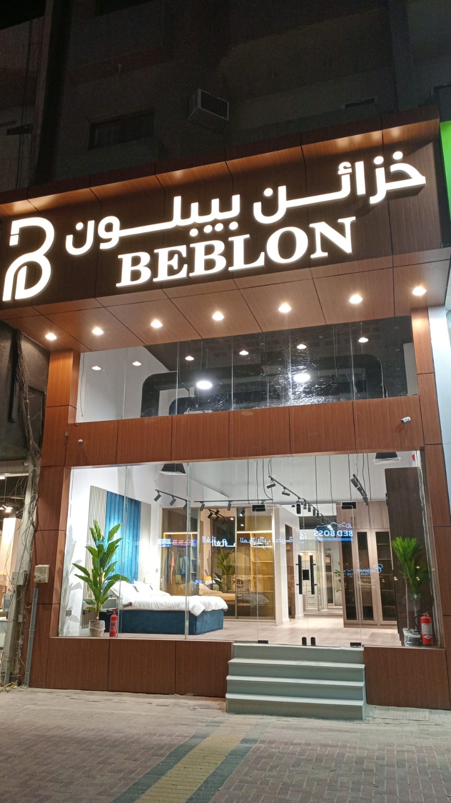
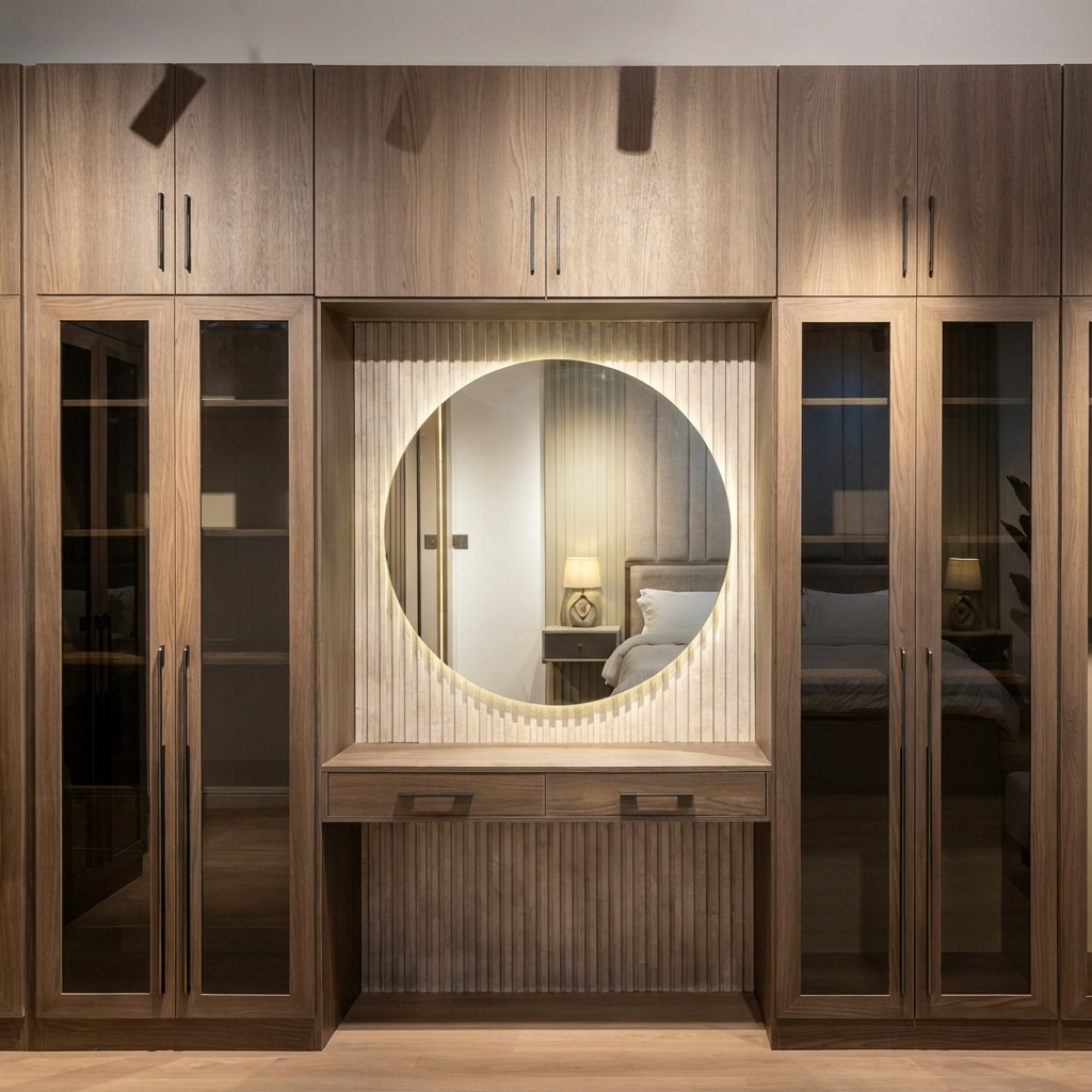
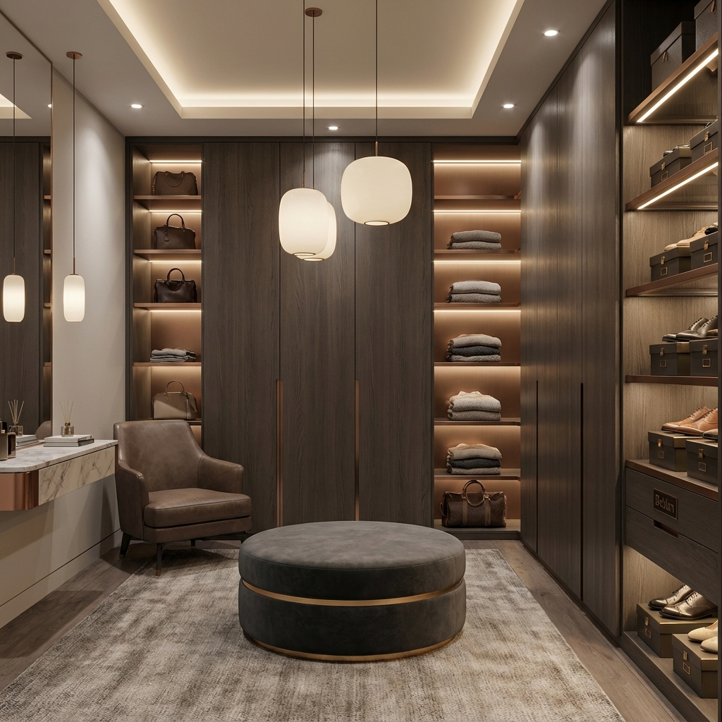
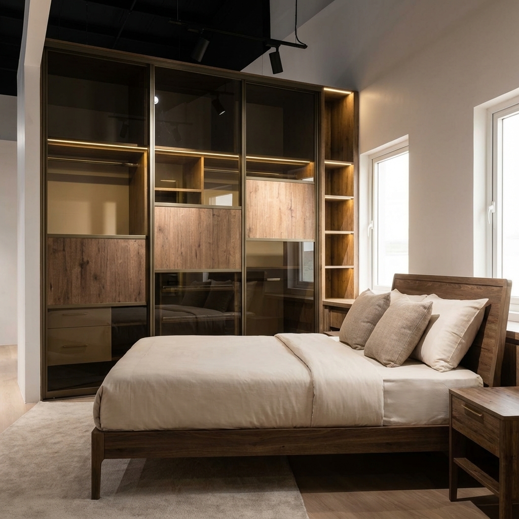
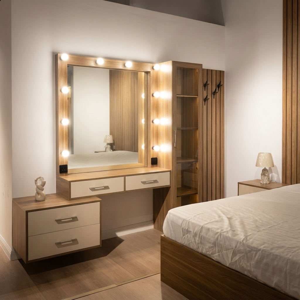
Photography Style
Our photography emphasizes warmth, craftsmanship, and luxury. Images should feel inviting while showcasing the premium quality of our furniture and spaces.
Photography Guidelines
- Warm, natural lighting (golden hour preferred)
- Clean, uncluttered compositions
- Focus on material textures and details
- Lifestyle context when appropriate
- Consistent warm color grading
- Cold, clinical lighting
- Over-saturated colors
- Heavy filters or effects
Image Treatments
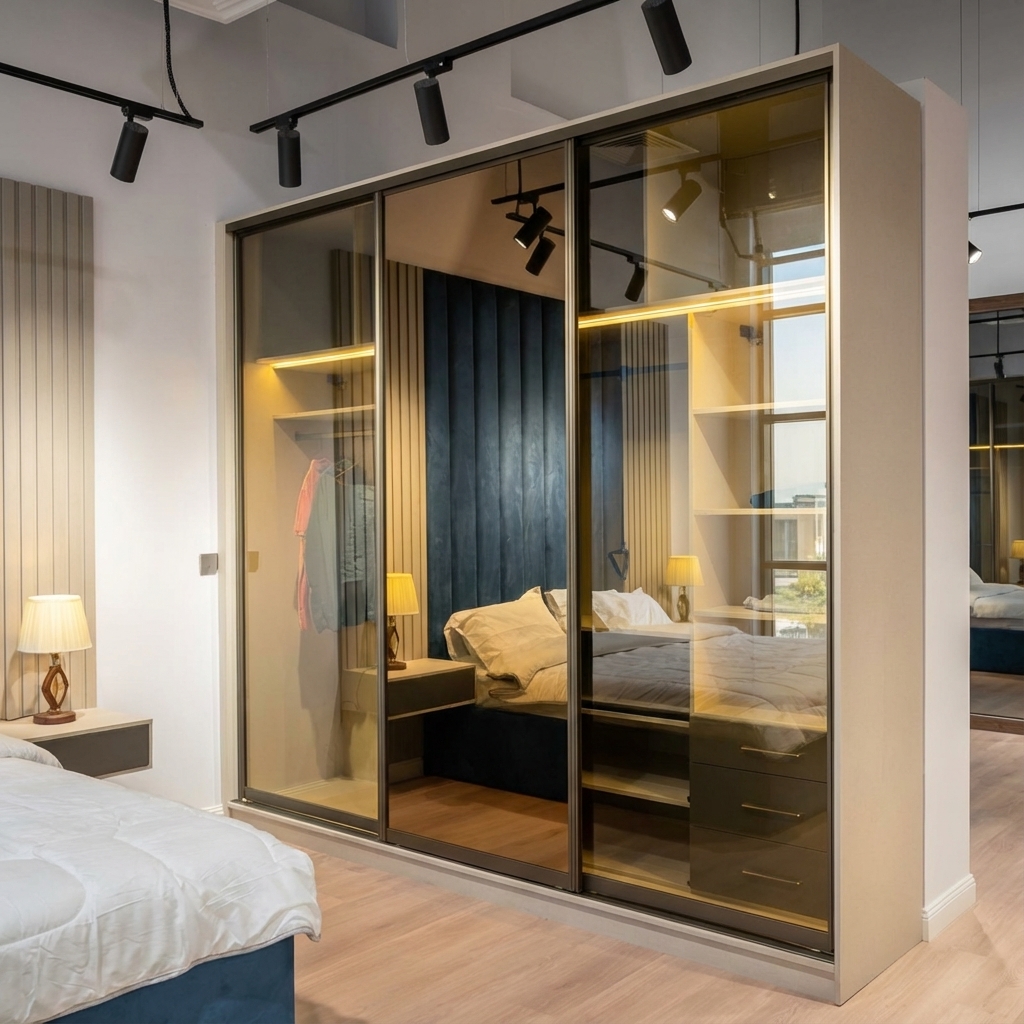
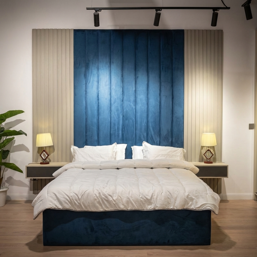
Product Gallery Examples
Voice & Tone
How we communicate with our audience
Brand Voice
Beblon speaks with confidence, warmth, and refined elegance. Our communication reflects our commitment to quality and our respect for our clients' discerning taste.
Confident
We stand behind our craftsmanship with pride
Warm
We create welcoming, personal connections
Refined
We communicate with sophistication and clarity
Authentic
We are genuine and transparent in all interactions
Writing Guidelines
Do
- Use clear, elegant language
- Focus on benefits and experiences
- Honor Arabic linguistic traditions
- Be respectful and professional
- Highlight craftsmanship stories
Don't
- Use technical jargon unnecessarily
- Be overly casual or colloquial
- Make exaggerated claims
- Use pushy sales language
- Neglect cultural sensitivities
Bilingual Communication
اكتشف خزائن وأثاث فاخر مصمم خصيصاً لتحويل مساحات معيشتك إلى ملاذات من الفخامة والراحة.
Discover bespoke wardrobes and premium furniture designed to transform your living spaces into luxurious sanctuaries.
Arabic content takes precedence for the Saudi market. English translations should maintain equivalent tone and meaning, not literal word-for-word translation.
Downloads
Access official brand assets
Color Palette
ASE, CLR, and CSS color files for design tools
Image Gallery
High-resolution product and lifestyle images
Questions?
For brand-related inquiries or to request additional assets, please contact our team.